Click on this link for the code : https://github.com/amritadutta25/Demand-Forecasting--Meal-Kit-Delivery

DEMAND FORECASTING
MEAL KIT DELIVERY SERVICE
More About the Project
Our Story
The meal kit industries are growing rapidly. It has shown 300% growth over the previous year, and is expected to double further in next 2 years.
Demand forecasting is a key component to every growing online business. Without proper demand forecasting processes in place, it can be nearly impossible to have the right amount of stock on hand at any given time. A food delivery service has to deal with a lot of perishable raw materials which makes it all the more important for such a company to accurately forecast daily and weekly demand.
Too much inventory in the warehouse means more risk of wastage, and not enough could lead to out-of-stocks — and push customers to seek solutions from your competitors.

Data Dictionary


Weekly Demand Info
Historical data of demand for a product-center combination
Fulfilment Center Info
Information for fulfillment center like center area, city information etc.
Meal Info
Product(Meal) features such as category, sub-category and cuisine
Exploratory Data Analysis
Analysis: Impact of Promotions on the number of orders
My team and I performed EDA to get to know the data better. First, we took a look at the impact of promotional activity and discount on the no. of orders. From the first graph we can see that on week 5 and 48, we have maximum no. of orders and on week 62 we have minimum orders. But why is it so? When we delved deeper, as you can see from the second graph, we found out that the email promotional activity was almost double in week 5 and 48 as compared to week 62.
Order Trend
Average orders per week


Promotion Trend
Promotional count per week
Analysis: Impact of Discount on the number of orders
Looking at this graph we can see that discounts and number of orders have no correlation. Thus, we learned although promotions have an impact on orders, discounts did not.
Discount offered per week

Analysis: Relation between Centers and number of orders
Here, we take a look at the centers. In the first graph, we can see center_id 13, which is of center_type B has most orders. Now when we take a look at the next graph, we find that center_type A has the max orders. The two graphs are quite contradictory. But why is it so? The third graph explains the contradiction. As you can see since center_type A has the maximum number of orders, naturally it has most number of orders.
Center_id vs Order Trend
Number of orders per center

Number of orders per Center_type

Number of centers per Center_type

Analysis: Meal Order trend
Finally, we analyzed meal-wise order trends. In terms of cuisine, the data showed Italian cuisine was ordered the most, followed by Thai, Indian and Continental. And in terms of food category, we observed beverages were ordered the maximum and it makes sense since we often order beverages alone or with other meals. On the lower end, we can see Biryani as the lowest ordered meal. It adds up since Biryani, a regional food of India, is not well known in the US market and hence very few people ordered it.
Cuisine-Order Trend
Distribution of orders cuisine-wsie


Food category-Order trend
Number of orders per Food category
Feature Engineering
Type 1
Using these insights we made two kinds of features to predict the demand for next week. This picture captures the weekly trend of price and orders. The ratio of price/avg_price_week_category indicates that the price of meal 1062 in week 1 is less than the average price of all beverages for the same week by 0.977. We also made features which capture the weekly average demand for all the categorical variables . For example the last column is the mean of beverages across different weeks. Note that The price and demand columns were converted to a log scale to get a more normal distribution.

Type 2
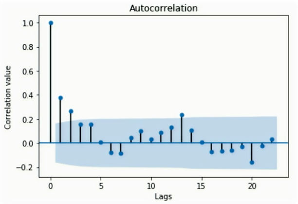
The second kind of feature we made was the lead and lag features which are the core of time series problems. To pick the number of lags, we plot the autocorrelation plot of demand. On the x-axis, we have the number of lags and the correlation value on the y-axis. If the values are outside this cone, then the value is statistically significant; otherwise, it could be by chance. Based on this, we choose to lag the features by two-time steps.
In the second figure, each row here is what goes into the model.So let's say we are in week 4 and we want to predict the demand for week 5 which is the last column in the table (target_lead). The num_orders is the orders for week 4, the expanding_mean is the mean of orders in all the previous weeks. The next column is the weighted average of week 4 orders and week 3 orders. Similarly, weighted_average_3w is the weighted average of week 4, week 3 and week 2 orders. We also have some features from week 5 like the discount offered which is captured by perc_diff_lead1 variable. Note that if this column is less than 0, then it indicates a discount.
Model Selection, Tuning and Results
Next, we split the data into train, validation and test sets. The table shows the results of the different models we ran. As visible Linear Regression gave the minimum mean squared error, however the R squared was not the best. keeping this in mind, we choose Random forest which gives comparable results across both the metrics. Also unlike linear regression, it can be tuned on the validation set and that’s what we did.

Let's get to Business
We decided to study the meal kit service market and adopt a convention that would help us quantify the profit our model brings to a company adopting our methodology in a Monetary sense.
Our assumption is as follows:
Cost of of each order = inventory cost + overhead cost + profit
(60%) + (30%) + (10%)
Inventory cost = Loss incurred during overprediction (Inventory loss)
Profit = Loss incurred due to underprediction (Order loss)
The inventory loss constitutes of the loss incurred due to raw material spoilage and is the inventory cost. Order loss is the loss incurred where demand is not fulfilled and hence leads to loss of an order i.e loss on the profit margin.
So let’s see if our model actually helps in forecasting our demand and saving some dollars? Look at the table below.
We would assume they would probably take the Average of the sales from week 1 to week 144 and predict it for the next week.
So let’s find out if our model is performing any better than the Baseline model in which case all us Analysts are out of business!
So if the baseline model predicts a demand of 4, the actual demand is 7 we would get a baseline loss of -3 which is 3 times our profit.
And say our ensemble model predicts 8 as the demand which leads to 1 times the inventory loss.
So what we got at was that the percentage of money saved due to our model when compared with the baseline was 36% which was around $106,600 per week.
